
Line chart showing the average age of women who got married for the first time each year, 2002 to 2020, for Spain, Italy, and Portugal. All three countries show a steady upward trend. Spain rises from about 28 in 2002 to about 35 in 2020 and is highest by 2020. Italy rises from about 28 in 2002 to about 33 in 2020. Portugal rises from about 25.5 in 2002 to about 32 in 2020, with a sharper increase after about 2010. Y axis spans roughly 18 to 36 and x axis covers years 2002 to 2020. Data source: OECD (2025). License: CC BY.
Women in Spain, Italy, and Portugal marry on average six years later than just two decades ago—
Marriage is closely linked to decisions about having children in many societies. It also matters for legal rights, family finances, and many other aspects of life.
05.03.2026 16:03
👍 58
🔁 14
💬 1
📌 3
✨ We have a whole new page on Work & Employment stats! ✨
02.03.2026 15:55
👍 17
🔁 8
💬 0
📌 0

World map showing the unemployment rate in 2025. The unemployment rate is the share of the labor force without work, but actively looking for a job and available to start soon. Figures are modeled estimates from the International Labour Organization in 2026, via the World Bank. The chart is licensed CC BY to Our World in Data.
Being unemployed isn’t the same as not having a job — at least when it comes to labor statistics.
The map shows unemployment rates around the world in 2025.
Let’s see what this number captures — and what it doesn’t 🧵
02.03.2026 15:15
👍 37
🔁 8
💬 1
📌 4

Slavery and forced labor have become less common over the last 250 years.
Line chart of the number of countries that had not yet abolished large-scale forced labor.
In 1789, 165 of the 174 countries covered had not yet abolished large-scale forced labor. In 2024, it was 9 countries.
Annotations on important cases, such as China, the Soviet Union, and the United States, say more about the history of slavery and forced labor.
✍️ New article: Tracking historical progress against slavery and forced labor: a long-run data view
For much of history, forced labor was widespread and brutal. Tens of millions of people were made to work under the threat of violence or punishment. The situation today is very different.
23.02.2026 12:00
👍 39
🔁 18
💬 3
📌 1

Annual industrial robots installed. Line chart showing annual installations for China, Japan, United States, South Korea, and Germany from 2011 to 2023. China starts near 23,000 in 2011, rises to about 57,000 by 2014, reaches roughly 150,000 by 2017 to 2018, then climbs sharply to about 260,000 in 2021 and peaks near 290,000 in 2022 before a small decline to around 275,000 in 2023, far above the other countries. Japan, the United States, South Korea, and Germany stay in the roughly 10,000 to 60,000 range across the period, with modest peaks around 2018. The y-axis spans 0 to 300,000. The data source is: International Federation of Robotics (IFR) via AI Index Report (2025). A note reads: Software (e.g., voice assistants), remote-controlled drones, self-driving cars, or devices such as “smart” washing machines are not classified as robots.
China’s adoption of industrial robots has surged over the past decade—
Industrial robots are rapidly becoming a common part of manufacturing in some countries.
07.02.2026 10:27
👍 45
🔁 14
💬 2
📌 3

Share of children with diarrhea receiving oral rehydration therapy. Horizontal bar chart showing percentage of children under five with diarrhea in the two weeks prior to the survey who received oral rehydration therapy (data for 2020 or most recent year). Values by country: Chad 17.4%; Cameroon 17.9%; Madagascar 19.6%; Central African Republic 23.4%; Senegal 26%; Rwanda 28%; Zimbabwe 32.8%; Sierra Leone 85.3%. Key point: Sierra Leone's share is much higher than the others, which cluster around 17 to 33 percent. Data source: Demographic and Health Surveys via World Bank (2025). License: CC BY.
Many children who could benefit from oral rehydration therapy for diarrhea still don’t receive it—
In 2021, around 1.25 million people died from diarrheal diseases. Around a third of these deaths were children.
15.01.2026 11:27
👍 49
🔁 12
💬 1
📌 2

1. Less skilled labor is abundant.
2. Skilled emigration is a brain drain.
3. Development substitutes for migration.
4. Migration substitutes for failing development, but doesn't cause development.
The International Monetary Fund asked me to review the literature on migration economics to draw lessons for low-income countries.
In a new @iza.org paper, I argue that policy for the 21st century must discard four outdated ideas.
www.iza.org/publications...
🧵 thread—>
18.12.2025 17:32
👍 223
🔁 108
💬 2
📌 14

A line chart showing annual CO2 emissions from fossil fuels and industry (not land use) for several countries from 1750 to 2024. Data from the Global Carbon Budget (2025)
We just published our “Top of the Charts”, a look at our most popular charts, articles, data insights & more in 2025! (link in 🧵)
Here are our top 5 most-viewed charts.
Each Friday over the next few weeks, we’ll share the top 5 for other categories (articles, etc.). Stay tuned!
1. CO2 emissions
05.12.2025 10:19
👍 74
🔁 29
💬 4
📌 4

In The OWID Brief newsletter, we have a section where our team writes about interesting things we've been reading lately.
In today's edition, we wrote about articles in Transformer and VoxDev:
www.transformernews.ai/p/claude-son...
voxdev.org/topic/trade/...
28.11.2025 17:19
👍 13
🔁 3
💬 1
📌 0

A line graph depicting life expectancy for French individuals of various ages, from 1816 to 2023. The y-axis represents life expectancy in years, ranging from 30 to 90 years. Each line corresponds to different ages: at birth, 10-year-olds, 25-year-olds, 45-year-olds, 65-year-olds, and 80-year-olds.
Each line shows fluctuations in life expectancy over time but there is a notable increase for all age groups. Significant historical events, such as the Franco-Prussian War, the Spanish Flu, and World War II, are marked on the timeline, indicating periods of impact on life expectancy.
The data sources for the chart are the Human Mortality Database and the UN WPP. The chart is licensed CC BY to Our World in Data.
Life expectancy has increased at all ages
03.11.2025 11:26
👍 88
🔁 18
💬 4
📌 3

The image presents a comparison of the leading causes of death in the United States for 2023 and the media coverage these causes receive from three news outlets: The New York Times, The Washington Post, and Fox News.
In the footer, it notes the data sources, indicating that the information is based on media mentions from Media Cloud (2025) and death data from the US CDC (2025) and the Global Terrorism Index, with a clarification that values are normalized to sum to 100%.
Does the news reflect what we die from?
07.10.2025 16:35
👍 337
🔁 199
💬 8
📌 37
💡New feature: hovering over links to charts shows a preview!
Look out for the little chart icon next to a link to know when you can see a preview.
Our colleague Ike Saunders had this idea just a couple days ago and he already built it and made it live on our site — thanks, Ike!
25.09.2025 15:47
👍 35
🔁 6
💬 1
📌 0

The image displays a line graph titled "Population projections until the end of the century." The graph plots population projections from 1950 to 2100, with population values ranging from 0 to 1.8 billion. Four colored lines represent different regions:
- A brown line indicates population projections for India, showing a steady increase peaking around 2060.
- A blue line represents China, which displays a peak around 2020 before declining.
- A red line shows Europe's population, which rises slightly before declining.
- A green line indicates the United States, which experiences moderate growth before leveling off.
Dotted lines illustrate the projections based on the United Nations' medium scenario assumptions. The data source is listed as "UN, World Population Prospects (2024)" The chart includes horizontal grid lines for better readability of the population figures and timelines. The overall design aims to convey trends in population growth and decline among these regions over time
India, China, Europe, and the United States are on very different population paths
05.09.2025 16:54
👍 105
🔁 31
💬 3
📌 15

Our @ourworldindata.org we visualise weekly updates of wildfire data from the Global Wildfire Information System.
Spain was having a pretty low/average year until the past few weeks when it went roaring past previous years.
You can track this data here:
ourworldindata.org/wildfires
22.08.2025 11:31
👍 72
🔁 29
💬 2
📌 2

Gold export data suggests that Peru, one of the world’s largest producers, mines nearly as much informally as it does formally—
According to official mining output records, Peru mined about 90 tonnes of gold in 2023, far ahead of any other South American country.
20.08.2025 16:30
👍 37
🔁 8
💬 1
📌 3


Duolingo came out fully embracing AI in April, and it’s hard not to read their latest revenue growth numbers alongside this new report on the state of formal language learning in the UK
13.08.2025 12:50
👍 8
🔁 2
💬 1
📌 0

A line chart showing the global number of people living in extreme poverty. Extreme poverty is defined as living below the International Poverty Line (IPL), which is $2.15 per day in 2017 prices (shown as a red line on the chart) and $3 per day in 2021 prices (shown as a blue line).
125 million people who would not have been counted as extremely poor before June 2025 (when the IPL was raised to $3 per day) are now included.
This data is adjusted for inflation and for differences in living costs between countries. The data source is the World Bank (2024 and 2025). The chart is CC BY Our World in Data.
✍️ New article: “$3 a day: A new poverty line has shifted the World Bank’s data on extreme poverty. What changed, and why?” 🧵
11.08.2025 15:52
👍 61
🔁 20
💬 1
📌 2
The reactions that many people had about 4o disappearing overnight really look like that scene from Her where Theodore realises the operating system is down. These screenshots I posted some weeks ago give a bit of a view into what some of these conversations that people miss actually looked like
12.08.2025 07:22
👍 4
🔁 1
💬 0
📌 0

$3 a day: A new poverty line has shifted the World Bank’s data on extreme poverty. What changed, and why?
In June 2025, the World Bank increased its extreme poverty estimates by 125 million people. This doesn’t mean the world has gotten poorer: it reflects a new, higher International Poverty Line of $3 a ...
When the World Bank publishes new poverty estimates, it makes headlines. But making sense of these numbers is harder than it looks! Inflation, PPPs, national poverty lines, real incomes…There’s a lot going on.
In this article my colleagues explain where the new numbers come from and what changed
11.08.2025 17:51
👍 15
🔁 4
💬 0
📌 0
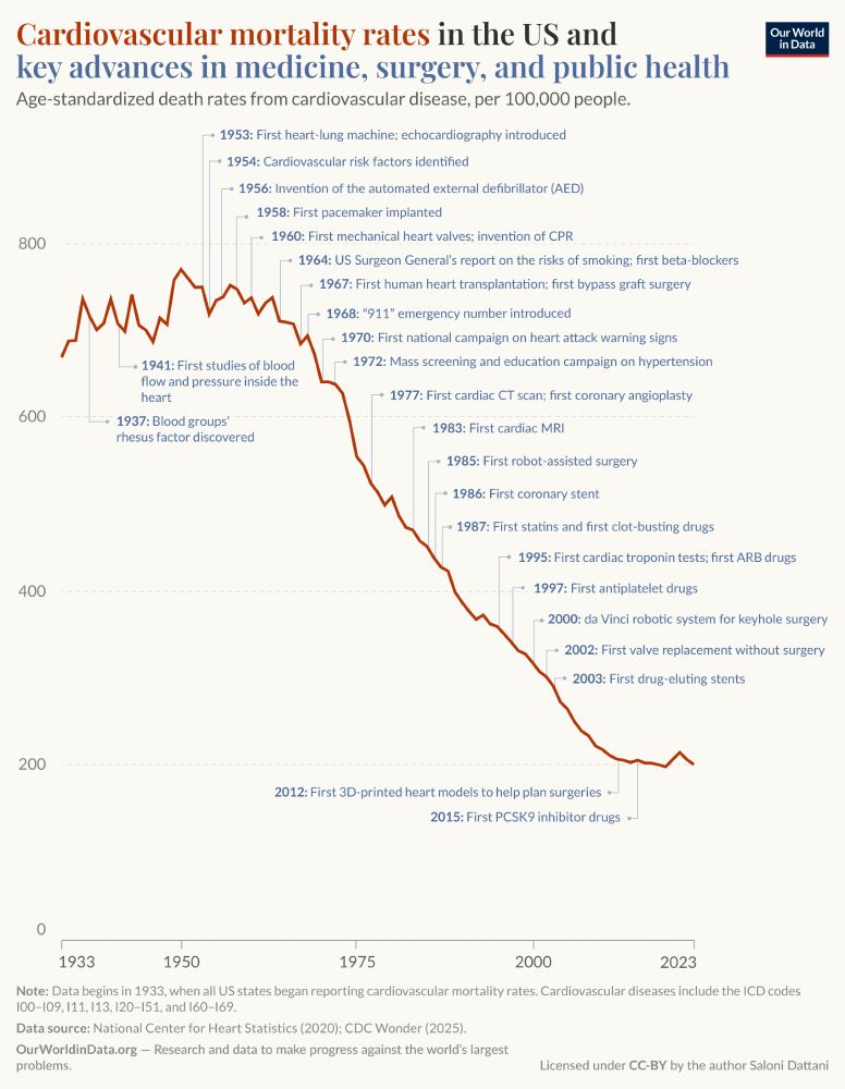
This image depicts a line graph showing cardiovascular mortality rates in the United States from 1933 to 2023, alongside key advancements in medicine, surgery, and public health. The y-axis represents age-standardized death rates from cardiovascular disease, ranging from 0 to 600. The x-axis represents years from 1933 to 2023.
The graph starts at around 600 deaths per 100,000 people in 1933 and trends downward sharply over the decades, indicating a significant decline in mortality rates. Key advancements are marked along the timeline, including the introduction of the first heart-lung machine in 1953, the first cardiac CT scan in 1977, and the first 3D-printed heart models in 2012.
Footnote information states that data begins in 1933 when all U.S. states started reporting cardiovascular mortality rates, sourced from the National Center for Heart Statistics in 2020 and the CDC Wonder in 2025. The chart is published by Saloni Dattani at Our World in Data.
New article by me!
Cardiovascular disease mortality rates have declined by around three-quarters since 1950, but we rarely hear about it.
I explore some of the reasons behind the decline.
ourworldindata.org/cardiovascul...
04.08.2025 12:52
👍 248
🔁 82
💬 11
📌 12
2/Cars are a useful comparison for thinking about technology adoption, because they are powerful, dangerous, and common. In just over a century, we moved from the first mass-produced car to about 1.2 billion cars on the road.
20.07.2025 17:48
👍 2
🔁 1
💬 1
📌 0

Beta 1.0 Is The Loneliest Number
Robots aren't your friends
Also, if this is just not a question or issue you had ever thought about, I recommend this post from @maiamindel.bsky.social
someunpleasant.substack.com/p/beta-10-is...
21.07.2025 12:10
👍 3
🔁 1
💬 1
📌 0


If you struggle to understand why/how people chat to ChatGPT for hours without any goal, just for fun, have a look at this conversation that someone posted on Reddit: www.reddit.com/r/ChatGPT/s/...
I’ll share the first couple of screenshots but click and read the whole thing, including comments.
21.07.2025 08:42
👍 3
🔁 2
💬 1
📌 1
A Threat Bigger than China | MIT Economist David Autor
YouTube video by Reid Hoffman
PS/ Here's the link to Autor's interview: youtu.be/MGKUTVyqJlI?...
20.07.2025 17:48
👍 0
🔁 0
💬 0
📌 0
17/ OK, this got very long. My point is that I think we need more coordinated approaches to rethink how we want to work with AI, especially in institutions that shape knowledge/skills. Leadership at universities should tackle this as an institutional challenge, and timing matters.
[END]
20.07.2025 17:48
👍 0
🔁 0
💬 1
📌 0
16/ I do think we should worry about how AI might evolve, we must stay mindful of its current limitations, we should demand more from policymakers and AI companies. But adoption isn’t waiting. For universities in particular, the time to thoughtfully engage with AI is now.
20.07.2025 17:48
👍 1
🔁 0
💬 1
📌 0
15/ I think an underlying issue is the gap in the public conversation that leaves people who could shape how AI is integrated into daily life feeling disempowered. Discourse swings between two extremes: AI is either dangerously powerful or disappointingly limited and can only make us dumber.
20.07.2025 17:48
👍 1
🔁 0
💬 1
📌 0
14/ I see this in higher ed too. We're spending much more preventing/catching plagiarism, than redesigning how students practice, reflect, and build expertise with AI.
Similarly, peer-reviewed journals seem on an unsustainable path: paper writing is getting easier with AI, but paper review isn’t.
20.07.2025 17:48
👍 1
🔁 0
💬 1
📌 0


