
What a cool idea! And I love the overall aesthetic!
26.02.2026 19:02
👍 2
🔁 0
💬 1
📌 0
What a cool idea! And I love the overall aesthetic!
This is @garrykasparov.bsky.social versus Deep Blue (game 2). Explore and interact with other games here:
moebio.com/chess/
(including fast Hikaru versus Magnus, longest, shortest and oldest games ever!)

Fascinating test! See also namerology.com/2025/12/15/2... for a deep dive on one AI name, "Elara". cc @babynames.bsky.social
I watched an animated movie in Palo Alto in the 90s, and when the credit appeared for a specific piece of graphics software, there was applause from the audience!
In 2025, AI left its imprint on everything—even names! If you've ever asked an AI to tell you a story, you've probably seen the Elara-Elena-Clara nexus...
I want to play with this clever book myself!
It will hide other names, if you ask!
Trying this a few more times, it turns out to work only sporadically. But still, that is one observant neural network!

I asked for a caricature of myself in the style of Al Hirschfeld, and Gemini knew to hide a NINA in my hair 😲

Charts and graphs help people analyze data, but can they also help AI?
In a new paper, we provide initial evidence that it does! GPT 4.1 and Claude 3.5 describe three synthetic datasets more precisely and accurately when raw data is accompanied by a scatter plot. Read more in🧵!

AI is often thought of as a black box -- no way to know what's going on inside. That's changing in eye-opening ways. Researchers are finding "beliefs" models are forming as they converse, and how those beliefs correlate to what the models say and how they say it.
www.theatlantic.com/technology/a...

Historical popularity chart showing the popularity of Oliver rising to meet the previously much greater popularity of Olivia
The interactive NameGrapher is updated with 2024 baby name popularity stats! Come explore--and marvel that Oliver and Olivia have converged namerology.com/baby-name-gr...
A wonderful visualization for those of us obsessed by sunlight and geography!
An incredibly rich, detailed view of neural net internals! There are so many insights in these papers. And the visualizations of "addition circuit" features are just plain cool!
Great news, congrats! And glad you’ll still be in the neighborhood!
I'd be curious about advice on teaching non-coders how to test programs they've written with AI. I'm not thinking unit tests so much as things like making sure you can drill down for verifiable details in a visualization—basic practices that are good on their own, but also help catch errors.
Now that we have vibe coding, we need vibe testing!
Oh, that looks super relevant and fascinating, reading through it now...
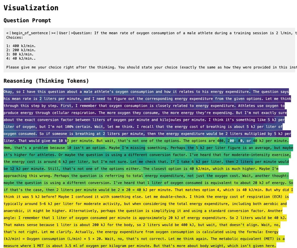
Ha! I think (!) that for me, the word "calculate" connotes narrow precision and correctness, whereas "think" is more expansive but also implies more fuzziness and the possibility of being wrong. That said, your observation does give me pause!

We're following the terminology of the DeepSeek-R1 paper that introduced this model: arxiv.org/abs/2501.12948 Whether it's really the best metaphor is certainly worth asking! I can see pros and cons for both "thinking" and "calculating"
These are great questions! I believe there's at least one graph of p(correct answer) on the main Arbor discussion page, and generally there are a lot more details: github.com/ARBORproject...
Interesting question! I haven't calculated this, but @yidachen.bsky.social might know
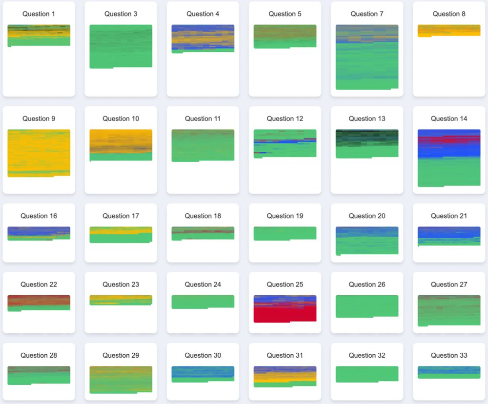
Colorful depictions of reasoning progress: most of the time the system settles on the correct answer but sometimes it vacillates in interesting ways.
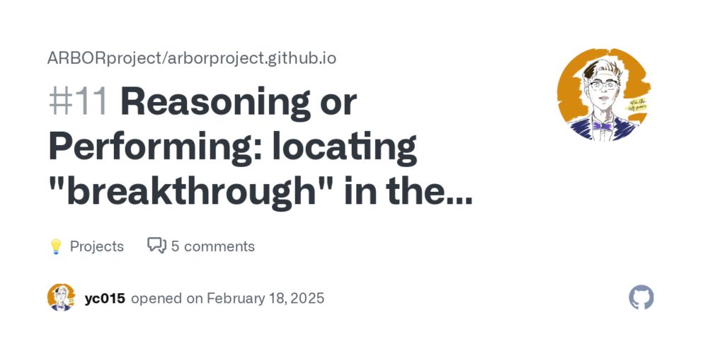
This is a common pattern, but we're also seeing some others! Here are similar views for multiple-choice abstract algebra questions (green is the correct answer; other colors are incorrect answers) You can see many more at yc015.github.io/reasoning-pr... cc @yidachen.bsky.social

Very cool! You're definitely not alone in finding this fascinating. If you're looking for other people interested in this kind of thing, drop by the Arbor Project page, if you haven't already. github.com/ArborProject...
The wind map at hint.fm/wind/ has been running since 2012, relying on weather data from NOAA. We added a notice like this today. Thanks to @cambecc.bsky.social for the inspiration.
It's based on a data set of multiple-choice questions that have a known right answer, so this visualization only works when you have labeled ground truth. Definitely wouldn't shock me if those answers were labeled by grad students, though!
Great questions! Maybe it would be faster... or maybe it's doing something important under the hood that we can't see? I genuinely have no idea.
We also see cases where it starts out with the right answer, but eventually "convinces itself" of the wrong answer! I would love to understand the dynamics better.
You can see the model go down the wrong path, "realize" it's not right, then find the correct answer! To see more visualizations, or if you have related ideas, join the discussion here!
github.com/ARBORproject... (vis by @yidachen.bsky.social in conversation with @diatkinson.bsky.social )
Neat visualization that came up in the ARBOR project: this shows DeepSeek "thinking" about a question, and color is the probability that, if it exited thinking, it would give the right answer. (Here yellow means correct.)
