

We followed its journey using satellite imagery in this visuals-led piece.
Your weekend read here with words by
@markpoynting.bsky.social and graphics by me
07.03.2026 08:01
👍 7
🔁 2
💬 1
📌 0
We followed its journey using satellite imagery in this visuals-led piece.
Your weekend read here with words by
@markpoynting.bsky.social and graphics by me

gallery of 9 satellite images from 3 January 2025 to 1 March 2026 showing A23a iceberg becoming smaller and smaller as smaller icebergs break away, and melt ponds appear on the surface.
We’ve tracked A23a iceberg for a while now, but this is our last story about it!
Once the world’s biggest (2x the size of Greater London), it drifted north up to 47ºN where warmer waters and seas broke it into smaller bergs, ending up as the world’s largest pool as melt ponds formed on its surface.


A special FT magazine issue all about maps is out today, w great pieces by @okr.bsky.social and @theboysmithy.ft.com, plus maps by me on how glacial melt is redrawing Alpine borders, the battle to redraw America and more
Read it online here (though best enjoyed in print!) www.ft.com/content/efab...
This is fantastic.
Engaging people with data through game play. Also has that very Gapminder-ish quality of challenging assumption.
Love it!
Woop! Finistère gave it away with just one!
Combien de bises? How many kisses for a greeting?
It's official 🎉
Visualising Climate 2026 is here! visualisingclimate.com
First international conference of its kind, it'll bring together artists, scientists, journalists all moved by the same desire to better communicate our changing climate 🌍
🗓️ Join us in Bologna, Nov 4-6
#dataviz #climatecrisis
Thank you Georgina! 🙏

Map of Antarctica's elevation beneath the ice. Blue areas indicate land below sea level, and brown areas indicate land above sea level. Large regions, especially in West Antarctica, lie below sea level. The new map reveals with more detail what landscape hides beneath the ice, with some corresponding photographs of similar landscapes in other parts of the world today, such as Alpine mountains, plateaus dissected by deep glacier-carved valleys, and flat plains.

Side-by-side maps comparing an older and a newer map of a zoomed area in East Antarctica’s elevation beneath the ice. Both maps use blue to show areas below sea level and brown to show areas above sea level. The newer map shows much finer detail, clearly revealing features such as the Golicyna Subglacial Highlands that are more difficult to distinguish on the older map.
Scientists have just unveiled the most detailed data yet of the terrain hidden under Antarctica’s ice. We mapped it and compared it to the previously best available data for our story with @markpoynting.bsky.social
www.bbc.co.uk/news/article...

The global warming trend continued in 2025. Each of the past 11 years (2015–2025) has been among the 11 warmest on record. Explore more data from #CopernicusClimate in the Global Climate Highlights 2025. #GCH2025
🔗 climate.copernicus.eu/global-clima...
@ecmwf.int

Which country consumes the most beer per person?
Think you can guess it in 5 tries or less? Have a try at chartle.cc

New exciting update to chartle.cc 📈
You can now use the *Explore data* mode after finishing a game to find out what all the other grey lines represent.
This has been requested by many of you, thanks for all the feedback! Let us know what you think!

Two part graphic showing the daily contribution of solar in Great Britain’s electricity. The top half is a single tile chart arranged in 30-minute blocks from midnight on left to 23:59 on right with each row representing one day and ordered top-to-bottom from 1 January to 31 December 2025. Blocks are shaded by strength of generation share. In 2025, more than a dozen blocks are dark orange to show share above 40 percent. Contribution in summer days is longer and generally stronger than in winter. The second part of the graphic repeats the format as a small multiple with one fart for each year from 2013 to 2024. Each year increases in strength over that period but 2025 is the greatest contributor overall.
New record year for renewable electricity in Britain - thanks especially to strong solar output.
Read our analysis of 2025 here www.bbc.co.uk/news/article...

Which country holds the world’s largest proven crude oil reserves?
Think you can guess it? Have a try at chartle.cc

#30daymapchallenge · Jour 30 · Relooking
🌍 Europe · Europa · Ευρώπη · Європа
🔍 Zoomez pour découvrir les villes d'Europe dans leur langue.
🔽 L'ancienne carte, en commentaire, utilisait un texte de substitution, réalisée pour le #30daymapchallenge 2024.
#cartographie #map #europe #europa
This has been such a lovely way to start class in my vis course over the past few weeks.

Can you guess the country in red just by analysing the chart?
Have a try at chartle.cc

Can you guess which country suddenly stopped all its nuclear power generation in the early 2010s, and then slowly restarted it?
Have a try at chartle.cc

Satellite image of north west Gaza shows position of Yellow line and 6 yellow blocks about 500m to the south, showing misalignment.
The Israeli military is placing large yellow blocks to delineate the newly established Yellow Line in Gaza - issue is, it’s off by over 500 meters in some areas, shrinking the Palestinian safe area.
www.bbc.co.uk/news/article...
DMs open or email me at hello@erwanrivault.com
Do you enjoy playing chartle.cc?
We’re opening up to the community!
Are you a scientist, journalist, researcher or just a data-enthusiast and would like to submit your own data (it should be a country-based time series)? Get in touch with us - we’d love to feature it!
New visual story: Bird migration is one of nature’s greatest spectacles — and scientists are uncovering extraordinary insights into how new threats are reshaping these epic journeys. Follow the remarkable travels of three birds as they fly across the planet. www.theguardian.com/environment/...

Can you guess which country went from producing almost 70% of its electricity from coal in the 1980s to just 0.82% in 2024?
Think you know? Try it at chartle.cc
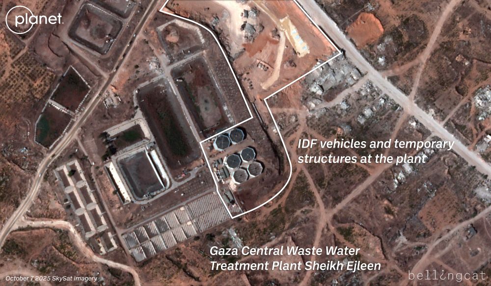
A SkySat satellite image from Planet Labs showing the Gaza Central Waste Water Treatment Plant Sheikh Ejleen south of Gaza City on October 7 2025. There is a large amount of destruction around the plant and near the plant grounds as well as in the plant itself there are IDF vehicles and temporary structures.

A SkySat satellite image from Planet Labs showing the Gaza Central Waste Water Treatment Plant Sheikh Ejleen south of Gaza City on October 7 2025. There is a large amount of destruction around the plant and a column of smoke is rising from the plant grounds. The IDF vehicles and temporary structures are gone.
October 11 SkySat imagery from @planet.com shows a column of smoke rising from the Sheikh Ejleen Waste Water Treatment Plant after the IDF withdrew from the base they established at the plant.
SkySat imagery from October 7 shows IDF vehicles and temporary structures set up inside the plant.

NEW: How mega batteries are unlocking an energy revolution
Massive shipping containers packed with powerful batteries are shoring up grids & extending the use of clean power
ig.ft.com/mega-batteri...
Latest visual story w/ @samlearner.bsky.social @inari-ta.bsky.social @samjoiner.bsky.social

Bar chart showing how many guesses players used to find the correct answer on chartle.cc
Daily Chartle player? We’ve got an update for you 👀
You can now see how everyone else scored when you finish the game (this is today's game). Keep the feedback coming, it’s helping us make chartle.cc better!
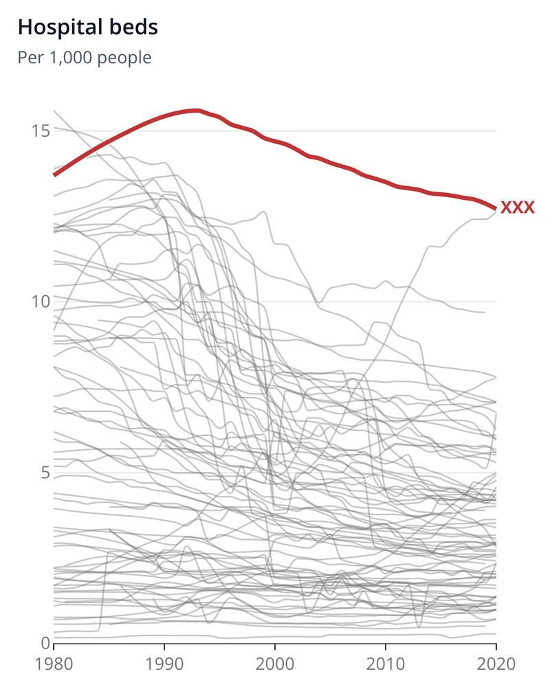
Can you guess which country has the most hospital beds per capita in the world?
Have a try by playing at chartle.cc

What about chartle.cc a daily chart game we just launched 3 weeks ago!
