A detailed map of the Mediterranean basin rotated 90 degrees clockwise immediately disrupts the sense of a familiar landscape and makes the sea and surrounding coatslines of Greece, Italy and North Africa seems like maps from a fantasy novel or mysterious fictional realm.
It’s all a matter of perspective…
07.03.2026 09:55
👍 11
🔁 1
💬 0
📌 0

Close-up photo of a clothing label showing size designations for different regions. The label reads 'EU US ASIA' on the left column and 'M S L' on the right column, demonstrating how the same physical size is labeled differently across continents. The label is sewn into what appears to be a gray fabric garment
Seems to fit?
06.03.2026 17:55
👍 8
🔁 0
💬 0
📌 0

YouGov poll showing how Britons view other countries as allies or threats. Rankings from most friendly to least: Australia/New Zealand/Canada (70%+ as allies) at top, through European nations in middle, down to China and Russia at bottom (seen as threats). Shows percentages for 'friend/ally', 'friendly rival', 'don't know', and 'unfriendly/hostile threat' categories
Ally, rival or enemy? How Britons view other countries...
yougov.co.uk/internationa...
06.03.2026 15:55
👍 7
🔁 2
💬 1
📌 0

Numbers poster listing costs of various medical services from the UK's NHS service From cheapest to most expensive: Average Prescription (£25), GP Appointment (£36), District Nurse (£70), GP Home Visit (£110), A&E Visit (£130), Ambulance Carriage (£275), and Average Inpatient Stay (£3283). Each service has an accompanying icon. The poster aims to inform about NHS service costs.
How much the UK's NHS services cost (even though they are given out free)
bit.ly/IIB-NHScosts
06.03.2026 12:55
👍 10
🔁 1
💬 1
📌 0

Bar chart showing yearly disease cases before (yellow) and after (pink) vaccine introduction in the US. Diseases listed include measles (4 million to minimal cases), chickenpox, whooping cough, mumps, hepatitis A & B, rubella, polio, smallpox, diphtheria, and tetanus. The dramatic reduction in cases after vaccination demonstrates vaccines' effectiveness. Data source: US CDC.
Because vaccines work
06.03.2026 09:55
👍 23
🔁 5
💬 0
📌 0

Satellite view of Earth showing primarily the Pacific Ocean side, with minimal visible landmasses. The image shows Earth as a blue sphere against the black of space, with a bright rim of atmospheric glow along the edge. This perspective showcases the vast expanse of the Pacific Ocean, which dominates most of the visible hemisphere, with only small portions of land visible near the edges, likely parts of Antarctica and South America. The ocean appears as various shades of deep blue, with some cloud patterns visible across its surface.
The side of the Earth we’re not used to seeing
The Pacific Ocean covers 32.4% of the planet’s surface (more than all land & ice combined)
The ocean’s widest point is 19,800km. The circumference of the Earth’s equator is 40,075km
(via reddit bit.ly/EarthSide)
05.03.2026 17:55
👍 14
🔁 4
💬 1
📌 0

A simplified map of the Star Wars galaxy, focusing on notable systems and hyperlanes. The map is divided into regions: Deep Core, Core Planets, Inner Rim, Mid Rim, Outer Rim, Wild Space, Unknown Regions, and Hutt Space. Key planets like Corellia, Tatooine, and Kashyyyk are labeled, along with their respective regions. The map provides a visual overview of the galaxy's layout and the interconnectedness of different planets and regions.
The Star Wars Galaxy Map - didn't realise it was so detailed.
by Deviantart User: stoneward13
www.deviantart.com/stoneward13/...
04.03.2026 17:55
👍 10
🔁 1
💬 1
📌 0

A playful scatterplot (using dog silhouettes instead of dots) depicts the best dog, according to data. On the vertical axis is a measure of public popularity. On the horizontal is an indexed score of several metrics to consider when owning a dog (cost, temperament, no. of genetic ailments etc). Each dog is coloured by category (sport, toy, hound etc) and sized (S, M, L). If a dog is facing left, it's kind of a dumb dog. If it's facing right, it's an intelligent dog.
It's fun to learn how to create impactful #infographics & data-visuals like this.
2 x virtual half days:
25th & 26th Mar 🇬🇧 UK/EU/AUS
29th & 30th Apr 🇺🇸 USA timezone
Mon 27th Apr 🇬🇧 LDN in-person
Details geni.us/WAB2024
Reviews geni.us/WABreviews
04.03.2026 15:55
👍 3
🔁 0
💬 0
📌 0

Poster by BMA Scotland highlighting challenges faced by GP surgeries. It notes that NHS spending on General Practice was 11% in 2008 and is projected to drop to 6.5% by 2025. There is one GP for every 1,515 patients in 2013, expected to change to one for every 1,735 by 2025. The poster emphasizes GP struggles due to less resources, fewer GPs, more patients, and more conditions, impacting service accessibility.
Why it can take 2 months to get an appointment in the UK’s National Health Service.
Useful & illuminating #infographic in the wild.
(by reddit user JetPac76)
04.03.2026 12:55
👍 4
🔁 1
💬 0
📌 0

Word cloud on autism risk factors. Header states autism is influenced by genetic and environmental factors. Larger text indicates higher risk factors: having an identical twin with autism, injury to the cerebellum at birth, and siblings with autism. Other risks: premature birth, very low birth weight, older parental age, serious viral infections during the first trimester, closely spaced siblings, male sex, pesticide exposure, and air pollution. Vaccinations, birth month, and parenting do not increase risk. Notes that 60-90% of risk comes from genes, but no single factor guarantees autism. Sources listed at the bottom.
Major risk factors for autism - visualized. Acetaminophen (paracetamol) use doesn’t even make the chart.
Viral & bacterial infection & fever during pregnancy ARE significant risk-factors + also why someone would take pain killers.
all data & sources bit.ly/AutismRisks
03.03.2026 17:55
👍 5
🔁 1
💬 3
📌 1

This map shows the most common baby boy names in Italy by region. Leonardo is the most popular name across most of the country, including Sardinia. Jonas appears in Trentino-Alto Adige. Andrea is the top name in Molise. Antonio is most common in Campania and Basilicata. Francesco leads in Apulia and Calabria. Sicily favors Giuseppe.
Most popular Italian Boy's Names :)
(via @amazingmap)
03.03.2026 12:55
👍 6
🔁 0
💬 1
📌 1

Twelve diagrams show sketches of different curves and describe the message they send in a humorous way. An exponential curve for example says “Look, it’s growing uncontrollably!”
Curve fitting methods & what they say xkcd.com/2048/
02.03.2026 23:55
👍 21
🔁 8
💬 0
📌 0

Infographic depicting over 1.6 million casualties in the Russia-Ukraine War. It shows ~90,000 Ukrainian soldiers killed, ~420,000 wounded, ~240,000 Russian soldiers killed, and ~900,000 wounded. Approximately 50% of the wounded are noted to return to the battlefield. Data sources are listed from February 2022 to December 2025.
An estimated 1.6 million casualties in 4 years of the terrible #ukraine war 🇺🇦
data & sources
geni.us/IIB-UkraineD...
02.03.2026 19:55
👍 6
🔁 0
💬 0
📌 1

A map illustrating the changing landscape of the North Sea region over time, specifically focusing on Doggerland, a now-submerged landmass that connected Great Britain to mainland Europe. The map shows the ice sheet coverage at different points in time (16,000 BC, 8000 BC, 7000 BC), revealing how the landmass gradually became submerged as sea levels rose.
Just 9,000 years ago Britain was connected to continental Europe by an area of land called Doggerland, which is now submerged beneath the southern North Sea. Part of the reason why the UK is a world leader in off-shore windfarms.
(by @historyinmemes)
02.03.2026 12:55
👍 18
🔁 6
💬 3
📌 2

A hand-drawn illustration depicting a woman's lower body and legs, used to visually represent different skirt lengths. The illustration shows a blue skirt with various colored sections marked to indicate the following lengths: Micro, Mini, Above knee, On knee, Below knee, Midi, Tea, Maxi, and Full.
Skirt lengths visually explained
By TikTok user: @theenticestudio
www.tiktok.com/@theenticest...
02.03.2026 09:55
👍 6
🔁 0
💬 0
📌 0

This population density map of Australia visualizes how most of the population is concentrated in coastal cities like Sydney, Melbourne, Brisbane, and Perth. The interior is mostly uninhabited, with labels like "NO ONE LIVES HERE" emphasizing the vast emptiness. The vertical spikes represent population density, showing the stark contrast between urban centers and the sparsely populated outback.
Love these population density spike maps.
(by @researchremora)
www.kontur.io/solutions/au...
01.03.2026 23:55
👍 10
🔁 1
💬 0
📌 1
This population density map of Australia visualizes how most of the population is concentrated in coastal cities like Sydney, Melbourne, Brisbane, and Perth. The interior is mostly uninhabited, with labels like "NO ONE LIVES HERE" emphasizing the vast emptiness. The vertical spikes represent population density, showing the stark contrast between urban centers and the sparsely populated outback.
Love these population density spike maps.
(by @researchremora)
www.kontur.io/solutions/au...
01.03.2026 23:55
👍 2
🔁 0
💬 0
📌 0

A stacked bar chart showing the evolution of U.S. household composition from 1960 to 2023. The chart illustrates the changing proportions of married parents, single parents, married couples without children, and single adults without children. Key takeaways include a significant increase in households without children and a decrease in households with married parents.
How the makeup of US households have changed 1960 vs today
(by @VisualCapitalist)
01.03.2026 19:55
👍 14
🔁 1
💬 0
📌 0
A stacked bar chart showing the evolution of U.S. household composition from 1960 to 2023. The chart illustrates the changing proportions of married parents, single parents, married couples without children, and single adults without children. Key takeaways include a significant increase in households without children and a decrease in households with married parents.
How the makeup of US households have changed 1960 vs today
(by @VisualCapitalist)
01.03.2026 19:55
👍 3
🔁 0
💬 0
📌 0

A visual comparison of the main ingredients in four popular Mexican dishes: tacos, burritos, quesadillas, and nachos. The image uses colored bars to represent the relative proportions of cheese, tortillas, and meat in each dish.
Checks out...
(by @mattsurelee)
26.02.2026 19:55
👍 8
🔁 1
💬 0
📌 0

Alt text: "Graph showing number of books released by male and female authors at different ages. Peak production age for both genders is around 46. Data source: Miller (1999) from a sample of 229 notable authors."

Graph titled "Painters - Peak Age of Production" showing the number of paintings created by artists at different ages from a sample of 739 painters. The peak production age is 35, with separate lines for male (blue) and female (beige) painters. Data source: Miller (1999).

Graph titled "Jazz Musicians - Peak Age" showing the number of albums released by artists of each age. The peak number of albums is at age 36. Data source: Miller (1999) from a sample of 719 notable jazz musicians.

Graph showing peak age for scientists' major discoveries and publications. The x-axis represents age ranging from 20 to 80, and the y-axis shows the number of discoveries. The purple curve (1935-1965) peaks sharply around age 37, while the green curve (post-1965) peaks more broadly. Annotations indicate that the burden of knowledge increased after 1965, requiring more time to master fields.
There's still time. Right?
26.02.2026 17:55
👍 8
🔁 3
💬 0
📌 2

ALT: Bar chart comparing official statistics of causes of death to media coverage. Heart disease and cancer have the highest death statistics but lower media coverage. In contrast, terrorism and homicide receive disproportionately high media attention despite lower death statistics. An illustration shows a person with a television for a head, symbolizing media influence. Text notes the disparity in news coverage frequency reflecting actual death causes. Data source is cited from Our World in Data.
Interesting
(via @Visualcapitalist)
www.voronoiapp.com/public-opini...
26.02.2026 15:55
👍 15
🔁 8
💬 0
📌 3
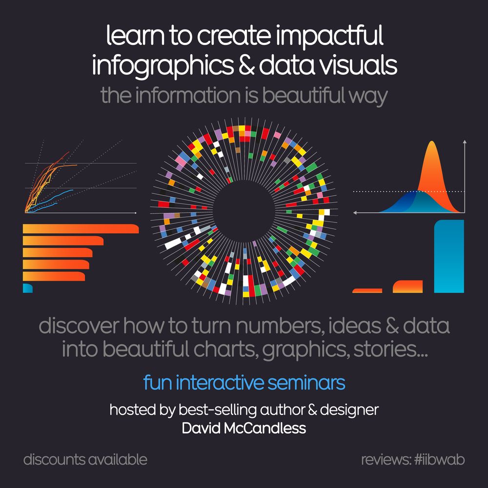
An infographic flyer advertising an online seminar for learning how to create impactful infographics and data visuals with best-selling author and data-visualisation practitioner David McCandless of Information is Beautiful. Discounts are available.

A photo of author and founder of Information is Beautiful, David McCandless, presenting a training in front of a large screen to a seated audience
Join @infobeautiful founder David McCandless for a rare in-person training in LDN 🇬🇧 and learn his concept-driven approach to data-visualisation:
Mon 27th Apr 🇬🇧 London
Deets: bit.ly/IIBWAB
Reviews: geni.us/WABreviews
26.02.2026 12:55
👍 0
🔁 0
💬 0
📌 0
A playful scatterplot (using dog silhouettes instead of dots) depicts the best dog, according to data. On the vertical axis is a measure of public popularity. On the horizontal is an indexed score of several metrics to consider when owning a dog (cost, temperament, no. of genetic ailments etc). Each dog is coloured by category (sport, toy, hound etc) and sized (S, M, L). If a dog is facing left, it's kind of a dumb dog. If it's facing right, it's an intelligent dog.
It's fun to learn how to create impactful #infographics & data-visuals like this.
2 x virtual half days:
25th & 26th Mar 🇬🇧 UK/EU/AUS
29th & 30th Apr 🇺🇸 USA timezone
Mon 27th Apr 🇬🇧 LDN in-person
Details geni.us/WAB2024
Reviews geni.us/WABreviews
25.02.2026 17:55
👍 1
🔁 0
💬 1
📌 0

"Graph illustrating percentage of Ukraine occupied by Russia from January 2022 to February 2026, showing 6.5% pre-invasion, peaking at 24.5% in March 2022, and decreasing to 20% by February 2026."
% of Ukraine occupied by Russia 2022-2025 #ukrainewar
24.02.2026 19:55
👍 19
🔁 6
💬 1
📌 0

A treemap illustrating military aid to Ukraine in billions of dollars. Europe provided $168 billion, with Germany contributing $50.2 billion, and Norway $20.6 billion. The UK, Netherlands, and other European countries also contributed. The United States provided $74.7 billion. Other contributions came from Canada at $5.1 billion and Australia at $1 billion. Data is sourced from the Ukraine Support Tracker by the Kiel Institute, covering February 2022 to December 2025.

ALT tag: "Bar chart titled 'Military Aid to Ukraine % of GDP' shows countries' aid relative to GDP. Norway leads with 4.3%, followed by Estonia at 3.1%, and Sweden at 2.8%. The USA is at 0.32%, despite leading in absolute dollars. Countries bordering Russia or Ukraine are marked. Source: Ukraine Support Tracker, Feb 2022 - Dec 2025."
Year 4 of this terrible #Ukrainewar. Europe has now given more military aid than any other bloc #Ukraine...
(source: @kielinstitute Ukraine Support Tracker)
24.02.2026 18:30
👍 9
🔁 0
💬 0
📌 0

Cross-section of road layers titled "A SLICE OF THE A303". Shows historical road types from modern to ancient: Modern 'A' Road, Turnpike Road, Medieval Cart Track, Roman Road, Bronze Age Trackway, Buried Turfline, and Natural Chalk. Each layer is illustrated with corresponding transportation icons, from cars to prehistoric animals.
Revealing cross section of a road in England
24.02.2026 15:55
👍 107
🔁 28
💬 5
📌 3

A detailed financial diagram showing U.S. federal government revenue ($4.5T) and spending ($6.2T) for 2023. Left side shows revenue sources in blue (including income taxes, Social Security, Medicare), right side shows spending categories in purple, with a $1.7T deficit highlighted. The visualization uses a waterfall chart style.
Interesting way of visualizing government budgets
via usafacts.org/reports/annu...
23.02.2026 19:55
👍 5
🔁 0
💬 0
📌 1
An infographic flyer advertising an online seminar for learning how to create impactful infographics and data visuals with best-selling author and data-visualisation practitioner David McCandless of Information is Beautiful. Discounts are available.
Last few seats remaining for our How to Create Impactful #Infographics training intensive
2 x virtual half days:
25th & 26th Mar 🇬🇧 UK/EU/AUS
29th & 30th Apr 🇺🇸 USA timezone
Mon 27th Apr 🇬🇧 LDN in-person
Deets: bit.ly/IIBWAB
Reviews: geni.us/WABreviews
21.02.2026 16:35
👍 2
🔁 1
💬 0
📌 0
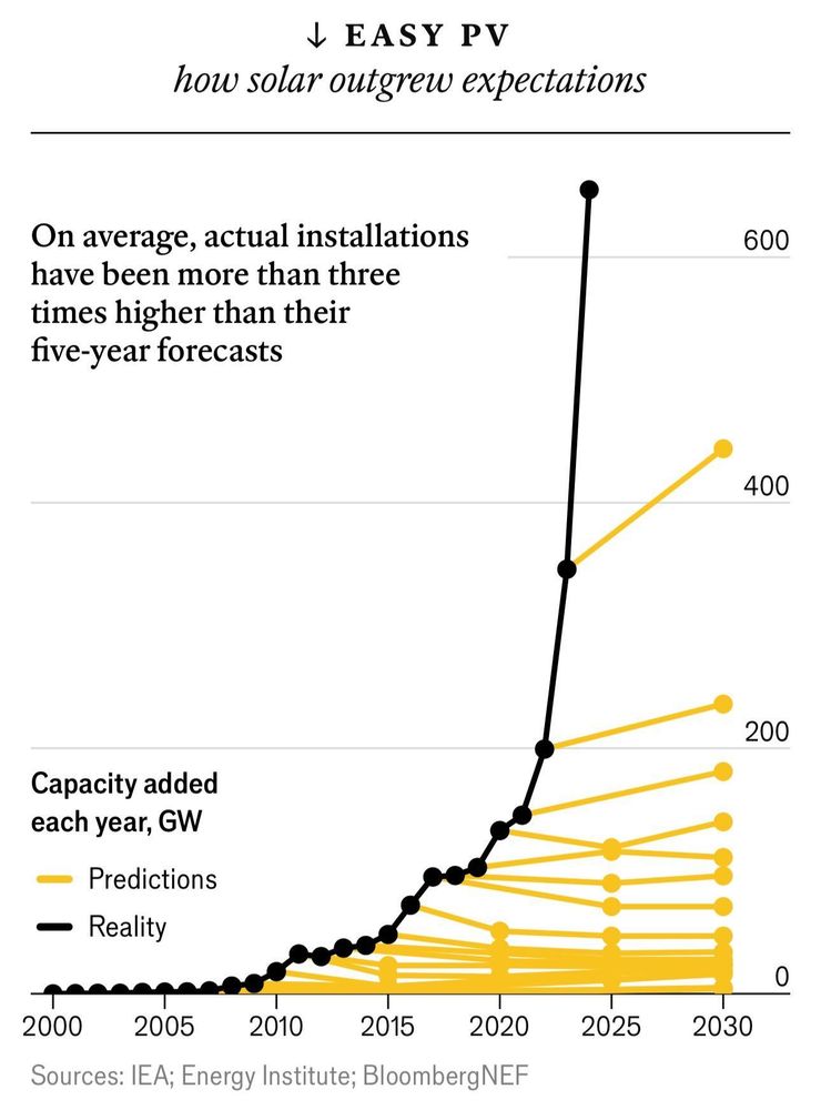
A line chart plots global capacity of solar power measured in gigawatts. From 2010 capacity starts to grow exponentially, way beyond a series of predictions drawn as lines in yellow. Actual installations have been more than 3x higher than their five year forecasts.
The world’s solar capacity reached 1,419 gigawatts in 2023, way beyond any predictions. 1 gigawatt = power for a medium sized city
21.02.2026 15:55
👍 15
🔁 4
💬 1
📌 0