Dart
Check out Dart - Over the past three years Alice Oswald has been recording conversations with people who live and work on the River Dart in Devon. Using these records and voices as a sort of poetic ce...
Spent *far* too long trying to find the perfect poem to illustrate `text-indent: 2em hanging each-line`.
Eventually stumbled across 'Dart' by Alice Oswald. It's fantastic. An epic poem about the river Dart in Devon.
uk.bookshop.org/a/16737/9780...
#typography #css #poetry
12.12.2025 11:39
👍 4
🔁 0
💬 1
📌 0
CSS text-decoration-inset landed in Firefox 146! Here's how it works:
11.12.2025 17:11
👍 196
🔁 38
💬 6
📌 9
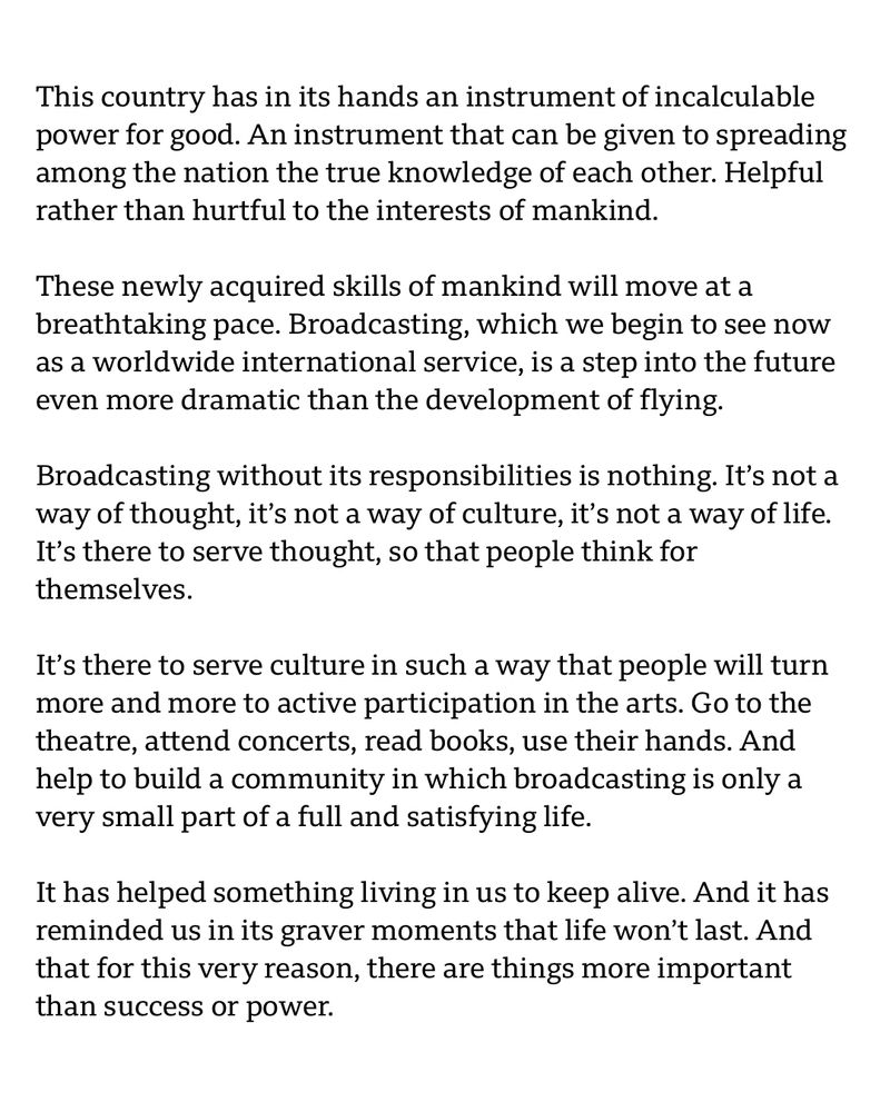
This country has in its hands an instrument of incalculable power for good. An instrument that can be given to spreading among the nation the true knowledge of each other. Helpful rather than hurtful to the interests of mankind.
These newly acquired skills of mankind will move at a breathtaking pace. Broadcasting, which we begin to see now as a worldwide international service, is a step into the future even more dramatic than the devеlopment of flying.
Broadcasting without its responsibilities is nothing. It’s not a way of thought, it’s not a way of culturе, it’s not a way of life. It’s there to serve thought, so that people think for themselves.
It’s there to serve culture in such a way that people will turn more and more to active participation in the arts. Go to the theatre, attend concerts, read books, use their hands. And help to build a community in which broadcasting is only a very small part of a full and satisfying life.
It has helped something living in us to keep alive. And it has reminded us in its graver moments that life won’t last. And that for this very reason, there are things more important than success or power.
In the early 1940s, Directors General of the BBC, Cecil Graves and William Haley spoke about the revolutionary technology of radio and television broadcasting.
[read attached image]
Now read that again, this time replacing ‘broadcasting’ with ‘AI’ and imagine how different things could be.
#ai
03.12.2025 12:59
👍 5
🔁 4
💬 1
📌 0

Text wrapping around dropcap A.
TIL about `initial-letter-wrap` as a handy way to wrap text around a drop cap. Sadly its 'at risk' as there is no browser support at the moment. Good candidate for progressive enhancement though.
drafts.csswg.org/css-inline/#...
#css #typography
28.11.2025 14:45
👍 11
🔁 1
💬 2
📌 0
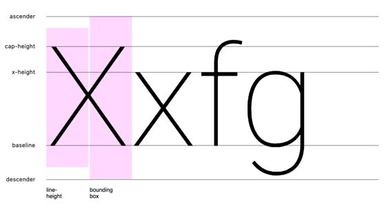
Vertical Metrics
Testing vertical metrics typography across browsers.
Now we have text-box in CSS, understanding font metrics is even more important so you know what you’re trimming. This is a very handy little website that allows you to upload a font that you plan on using, along with a Google font picker.
vertical-metrics.netlify.app
17.06.2025 13:03
👍 55
🔁 14
💬 1
📌 0
This has to be bargain of the year. So many fantastic typefaces half price.
#typography
11.12.2024 22:06
👍 3
🔁 1
💬 0
📌 0
Airport Typeface
Loving the fabulous website and fascinating story behind Airport, Matthew Carter's typeface for a pre-Heathrow London Airport.
airport.revolvertype.com
Includes an interview with Carter, "you'd think was a rip-off of Helvetica. But we’d never seen Helvetica in 1961 in London."
#typography
04.12.2024 09:01
👍 3
🔁 2
💬 0
📌 0
Richard Rutter (@clagnut.com) posting mostly about
#webtypography and related #typography, #fonts and general #design goodness. Scattered with a few book updates.
04.12.2024 08:48
👍 4
🔁 0
💬 0
📌 0