Chart of trends in recovered organs from circulatory deaths
The number of organs available for donation has risen massively in the past five years.
It seems to be the result of technological advances in preserving organs after circulatory death.
jamanetwork.com/journals/jam...
01.03.2026 08:30
👍 204
🔁 43
💬 4
📌 4

Entretien avec Sarah Maldoror, présidente de la Troupe Les Griots à propos de la pièce Les Nègres de Genet. Propos recueillis en 1958 par Marguerite Duras. Planche de bande dessinée au graphisme stylisée en niveaux de gris 1/2

Entretien avec Sarah Maldoror, présidente de la Troupe Les Griots à propos de la pièce Les Nègres de Genet. Propos recueillis en 1958 par Marguerite Duras. Planche de bande dessinée au graphisme stylisée en niveaux de gris 2/2
Et les nerfs de nos chairs comme des cartes marines, dans Panthere Première pantherepremiere.org/texte/et-les...
01.03.2026 08:56
👍 4
🔁 2
💬 0
📌 0
When D3 was released in February 2011, it transformed how we build data visualizations for the web and ushered in a new age of unbridled creativity in information design, data journalism, and beyond. Today, it remains the backbone of modern, interactive data viz.
Happy 15th birthday, D3 🎂
d3js.org
27.02.2026 20:38
👍 163
🔁 38
💬 0
📌 7

Simulated null distribution for data with a sample size of 100, difference in group means of 5, and a p-value of 0.142

Simulated null distribution of a slope of 0.8 and p-value of 0.002

Finally, we have to decide if the p-value meets an evidentiary standard or threshold that would provide us with enough evidence that we aren’t in the null world (or, in more statsy terms, enough evidence to reject the null hypothesis).
There are lots of possible thresholds. By convention, most people use a threshold (often shortened to α) of 0.05, or 5%. But that’s not required! You could have a lower standard with an α of 0.1 (10%), or a higher standard with an α of 0.01 (1%).
Statistically significant
The p-value is < 0.001 and our threshold for α is 0.05
In a world where there is no relationship between x and y, the probability of seeing a slope of at least 0.901 is < 0.1%
Since < 0.001 is less than 0.05, we have enough evidence to say that the slope is statistically significant.

Evidentiary standards
When thinking about p-values and thresholds, I like to imagine myself as a judge or a member of a jury. Many legal systems around the world have formal evidentiary thresholds or standards of proof. If prosecutors provide evidence that meets a threshold (i.e. goes beyond a reasonable doubt, or shows evidence on a balance of probabilities), the judge or jury can rule guilty. If there’s not enough evidence to clear the standard or threshold, the judge or jury has to rule not guilty.
With p-values:
If the probability of seeing an effect or difference (or δ) in a null world is less than 5% (or whatever the threshold is), we rule it statistically significant and say that the difference does not fit in that world. We’re pretty confident that it’s not zero.
If the p-value is larger than the threshold, we do not have enough evidence to claim that δ doesn’t come from a world of where there’s no difference. We don’t know if it’s not zero.
Importantly, if the difference is not significant, that does not mean that there is no difference. It just means that we can’t detect one if there is. If a prosecutor doesn’t provide sufficient evidence to clear a standard or threshold, it does not mean that the defendant didn’t do whatever they’re charged with†—it means that the judge or jury can’t detect guilt.
I just whipped up this little #QuartoPub site last week that demonstrates how I teach p-values/hyp-testing through simulation both with live OJS and with #rstats, and I think it's super neat! It has examples for diff-in-means, diff-in-props, and regression slopes nullworlds.andrewheiss.com #statsky
11.02.2026 21:14
👍 139
🔁 26
💬 3
📌 5
Reminded me of this (if you think of structural breaks as shifting between equilibria on an S-curve).
observablehq.com/@fil/fitting...
web.archive.org/web/20220523...
Also shows why historical/domain-specific intuition is so important.
HT @fil.rezo.net and Constance Crozier
28.08.2025 18:17
👍 2
🔁 2
💬 0
📌 2

Observable Notebooks 2.0 in Fora Health — Screen Studio
Observable Notebooks 2.0 in Fora Health — Created and shared with Screen Studio
Big fan of @observablehq.com and since their preview release of Observable Notebooks 2.0 my team at Fora Health have integrated Notebook Kit into our app. Works really well so far. Quick demo ⬇️
screen.studio/share/TqvyfFbU
09.09.2025 14:28
👍 12
🔁 5
💬 2
📌 1
Observable Notebooks Database connectors | Observable
Observable Notebook Kit and Desktop 1.1 are out. Headline feature: database connectors! 🎉 You can now query DuckDB, SQLite, Postgres, and Snowflake directly from notebooks. And it’s self-hosted. And it saves results automatically for performance and stable analysis. observablehq.com/notebook-kit...
27.08.2025 14:04
👍 42
🔁 9
💬 2
📌 0

a choropleth map of the western us highlighting the federal lands that are proposed to be sold, colored by blm and USFS
charts you hate to see
17.06.2025 23:30
👍 4
🔁 2
💬 1
📌 0

Typical photograph of undisturbed seabed at the control site with polymetallic nodules, from Jones et al., Nature, 642,112-118, 2025.

Area of track with complete removal of nodules by deep-sea mining in the centre and deeper propulsion tracks either side, from Jones et al., Nature, 642,112-118, 2025.
Very interesting open access article about the "Long-term impact and biological recovery in a deep-sea mining track" by D.O.B. Jones and colleagues. Their photos of the ocean floor after mining, before and after, are simply shocking. #geoscience
www.nature.com/articles/s41...
16.06.2025 08:32
👍 14
🔁 7
💬 1
📌 0
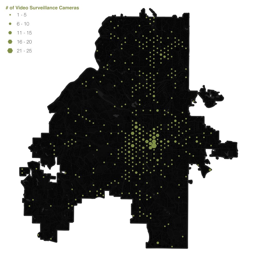
City of Cameras
Atlanta is the most surveilled city in the United States. With 124.14 surveillance cameras per 1,000 people, we not only lead the country, we have more than twice as many cameras per capita as 2nd …
Atlanta is the most surveilled city in the United States.
But because the Atlanta Police Department claims that releasing the locations of these 60,000+ cameras will lead to terrorism, we’ve not been able to map their locations...
Until now. Read more 👇👇
09.06.2025 17:01
👍 184
🔁 102
💬 7
📌 9

https://gallica.bnf.fr/ark:/12148/bpt6k4603552m/f1.image
Fut un temps où les questions géopolitiques avaient une place de premier plan dans l'espace public en France, y compris avec de fantastiques efforts carto & dataviz
Les modifications de #frontières dans les Balkans à la Une du journal Excelsior, 21/2/1921
05.06.2025 18:45
👍 82
🔁 18
💬 5
📌 1

As the United States vetoes another Israel-Palestine ceasefire resolution at the UN Security Council, here's a graphic I made for @afp.com showing every veto on a similar resolution since 1970.
04.06.2025 20:20
👍 3
🔁 4
💬 0
📌 0
bump bump
04.06.2025 20:27
👍 3
🔁 1
💬 0
📌 0

A page of the atlas featuring two photos of clouds and two diagrams describing their types and characteristics

A page of the atlas featuring a photo of cirrus clouds and a diagram of its filaments
"The 1930’s International Atlas of Clouds + of States of the Sky... provides a detailed textual description of different kinds of clouds, their shapes, the occurrences of the clouds, their behaviour, and a description of the disturbances the clouds indicate." socks-studio.com/2024/03/24/o...
20.05.2025 02:29
👍 44
🔁 13
💬 0
📌 1
Vous n'aimez pas le covid ? 😷
Vous aimez bien les cartes ? 📍
Ce fil est fait pour vous ! ⤵️
#AutoDéfenseSanitaire
#CovidIsNotOver
19.05.2025 15:54
👍 19
🔁 16
💬 2
📌 3

A trick for fitting world maps on phones:
Stack two azimuthal equal-area projections, clipped at 90° longitude, each one rotated 180° from the other.
The bottom map covers the top's Antarctica, which reduces the total height and looks nice.
As seen in www.nytimes.com/2025/04/25/c...
27.04.2025 01:23
👍 84
🔁 15
💬 3
📌 5
Created by Sabine Réthoré
www.sabine-rethore.net
mediterraneesansfrontieres.org
this map is a beauty
18.05.2025 16:29
👍 9
🔁 1
💬 0
📌 0
On the love ⟷ hate gradient for marmite maps I'm firmly on the right hand side
17.05.2025 16:19
👍 5
🔁 0
💬 0
📌 0
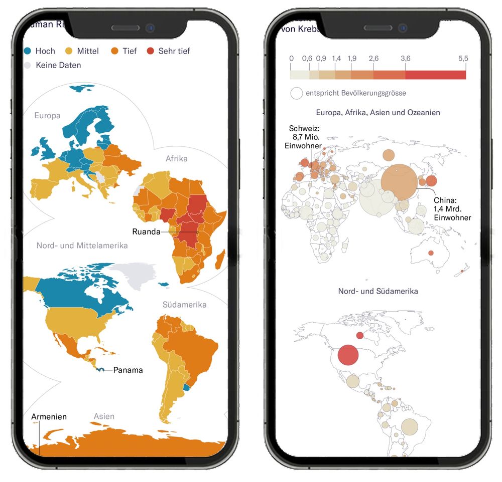
Two smartphones displaying alternative thematic world maps.
The left screen shows a split-continent map with countries grouped and resized by region (e.g., Europe, Africa, Asia) using color to indicate data levels (legend: Hoch, Mittel, Tief, Sehr tief). Smaller countries like Rwanda and Panama are clearly labeled and more visible due to the rearranged layout.
The right screen displays a bubble map, where countries are represented by circles scaled to population size and shaded by data intensity. Larger countries like China and the U.S. have prominent bubbles, while smaller countries remain visible. Labels indicate population figures for Switzerland and China.
Better world maps for mobile!
Despite years of mobile-first design, there’s been little experimentation in this area. So we designed our own at NZZ – and validated it in a large user study.
Summary of the paper: jonasoesch.ch/articles/the... 1/3
14.05.2025 09:38
👍 124
🔁 35
💬 5
📌 6
First fault movement ever filmed. M7.9 surface rupture filmed near Thazi, Myanmar
YouTube video by 2025 Sagaing Earthquake Archive
I am speechless...
>> First fault movement ever filmed. M7.9 surface rupture filmed near Thazi, Myanmar
m.youtube.com/watch?v=77ub...
12.05.2025 01:17
👍 1907
🔁 661
💬 40
📌 250
I love these!
10.05.2025 14:35
👍 7
🔁 1
💬 0
📌 0
The sun rises on the right and sets on the left.
08.05.2025 21:21
👍 0
🔁 0
💬 0
📌 0

2 by 5 grid of maps showing subsidence rate in 10 American cities, calculated using an average from 2015 to 2021. Houston is dropping most rapidly, with rates over 8 millimeters per year.

Detailed map of land subsidence (red/orange) and rise (green) for Washington, DC. The land is dropping most rapidly in areas of fill (East Potomac Park). Most built-up areas of the sixty are also dropping, but land along the Anacostia River is rising.
A detail to love in these maps by @naemas.bsky.social: the palette is asymmetric (subsiding values go to -8, uplifting values to +2), underscoring how land in many American cities is sinking much faster than it is rising. wapo.st/3F586ov
#dataviz 📊 #maps #cartography 🗺️
08.05.2025 18:29
👍 12
🔁 1
💬 0
📌 1
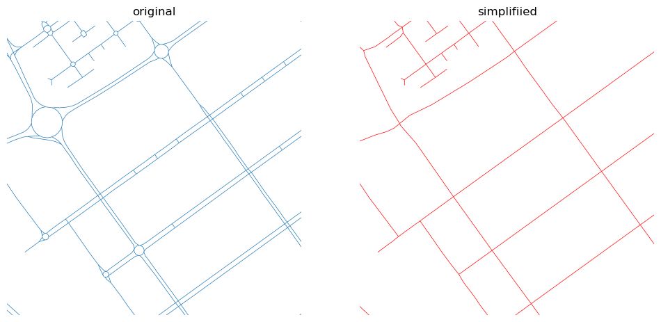
Original network on the left, simplified one on the right.
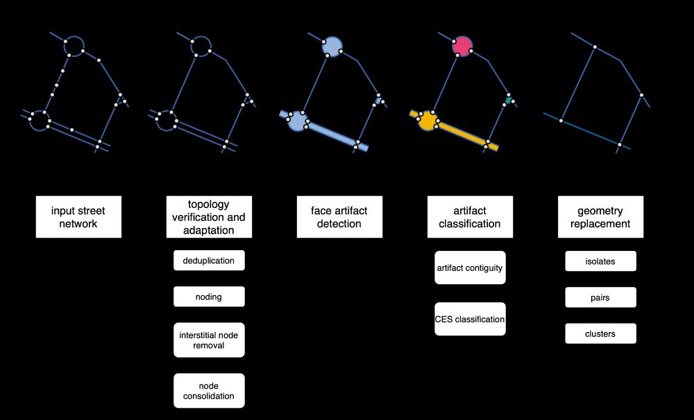
Diagram of the neatnet's workflow.

Image of face artifacts.
Ever needed to simplify street networks? I did. And it is a pain. So we wrote an algorithm that does that for us. And can do for you, as it is available as a Python package called `neatnet`.
Here's a short blog about it - martinfleischmann.net/simplificati... and package - uscuni.org/neatnet
28.04.2025 20:45
👍 81
🔁 19
💬 5
📌 0

"A new dataset, visualized as maps, reveals the extent to which African workers are indirectly employed in the tech sector, doing content moderation, customer service, and data annotation for AI models, among other jobs." restofworld.org/2025/big-tec...
28.04.2025 11:50
👍 280
🔁 121
💬 8
📌 13

#MapMonday On this day in 1986, 2 days after the nuclear accident at Chernobyl power station, Soviet TV news show, Vremya, announced the event.
This map graphic from www.bbc.co.uk/news/science... shows radiation levels after a study in 2019
28.04.2025 07:01
👍 2
🔁 2
💬 0
📌 0
> Like typical triangles, it has three sides and three corners.
wow!
27.04.2025 17:25
👍 1
🔁 0
💬 0
📌 0